

Historical Scheduling and Usage Breakdowns
On this page we present historical information of the scheduling coefficient (which indicates queue time) and usage broken down by quarter.
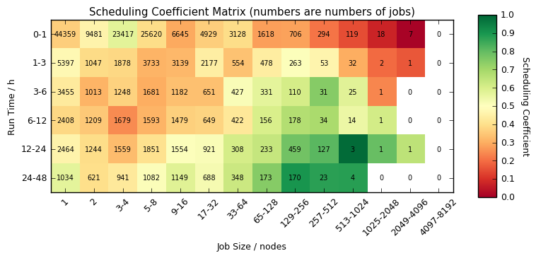
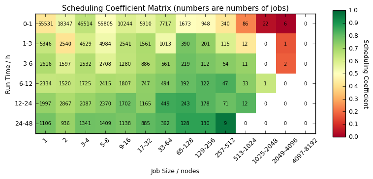
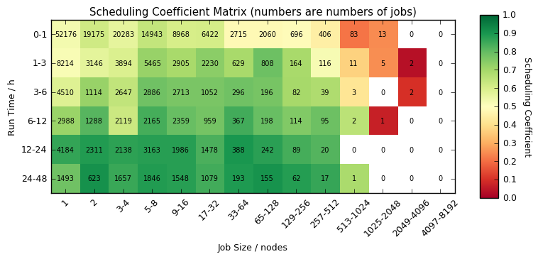
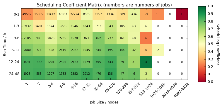
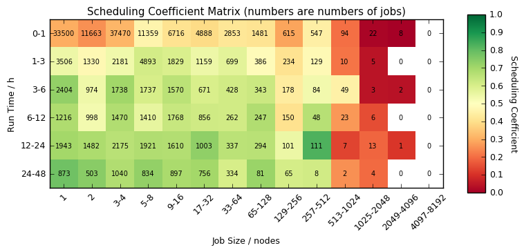
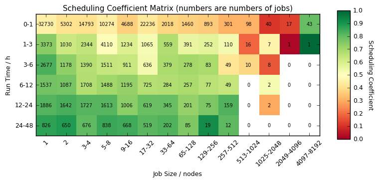
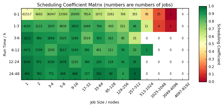
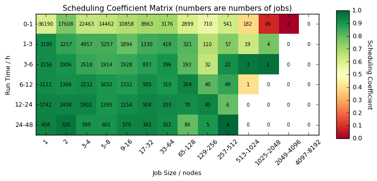
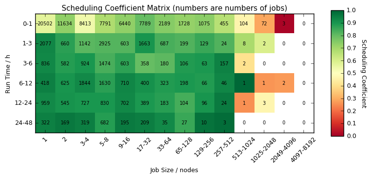
Scheduling Coefficient by Quarter
The heatmaps below provide information on the mean queue times on ARCHER over pst periods for different job sizes/lengths. The colour in the heatmap indicates the mean queue time as measured by scheduling coefficient for each class and the number in the box is the number of jobs of that class.
The scheduling coefficient is the ratio of run time to run time plus queue time and, as such, represents the fraction of the time in the queue that was spent running. A value of 1 indicates that the job started instantaneously and a value of 0.5 indicates that the job queued for the same amount of time that it ran for.
Q1 2016
Q4 2015
Q3 2015
Q2 2015
Q1 2015
Q4 2014
Q3 2014
Q2 2014
Q1 2014
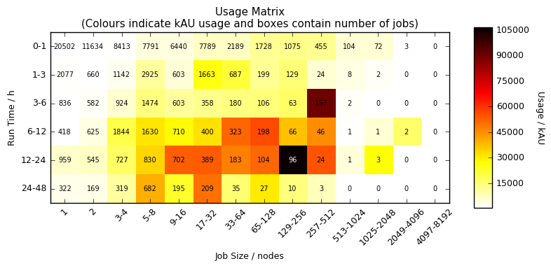
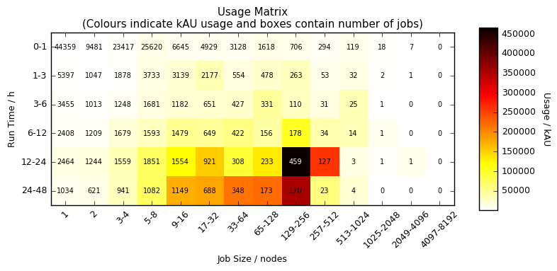
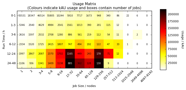
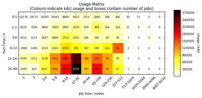
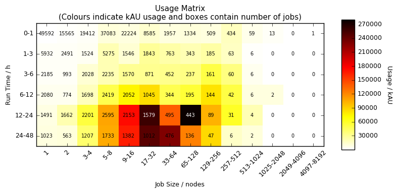
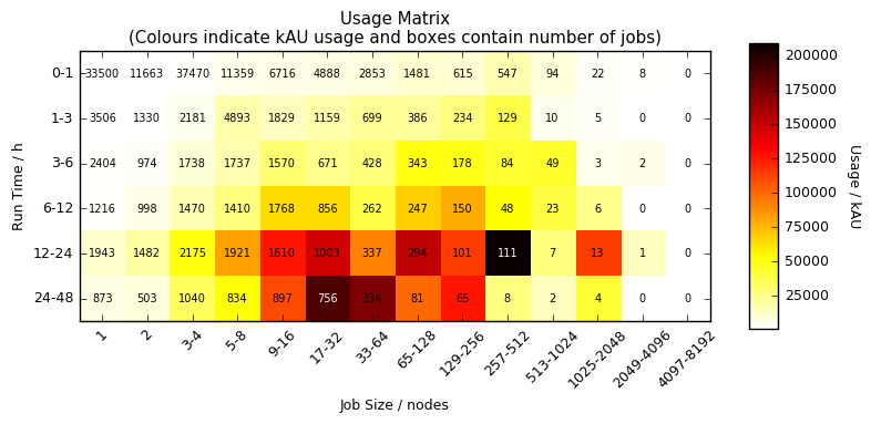
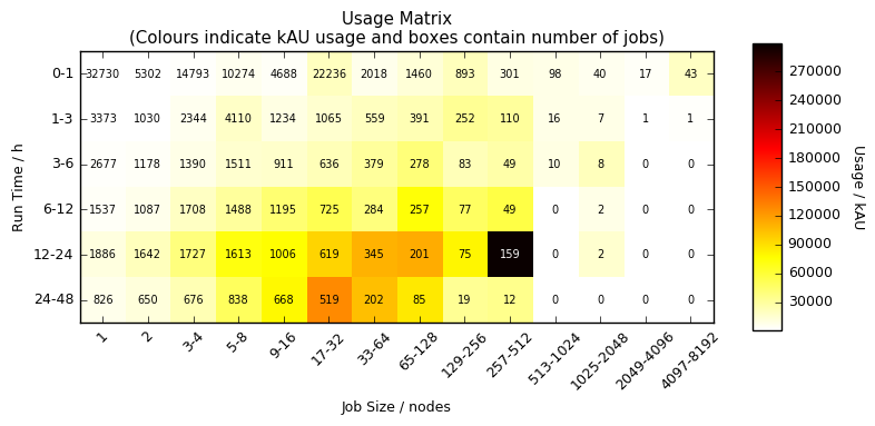
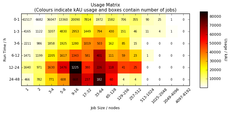
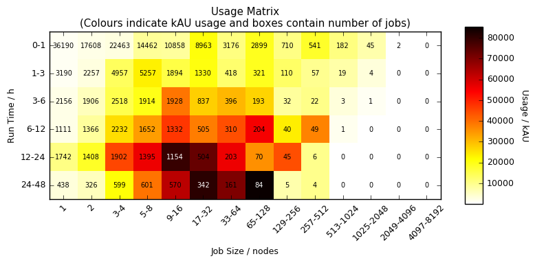
Usage Breakdown by Quarter
The heatmaps below provide information on the usage on ARCHER over past periods for different job sizes/lengths. The colour in the heatmap indicates the number of kAU expended for each class and the number in the box is the number of jobs of that class.
Q1 2016
Q4 2015
Q3 2015
Q2 2015
Q1 2015
Q4 2014
Q3 2014
Q2 2014
Q1 2014